

Workflow Intelligence
Building an operational intelligence platform for software delivery
A workflow analytics platform that transforms Jira and GitLab activity into actionable engineering insights through deterministic metrics, evidence-driven dashboards, and AI-assisted analysis.
- Role
- Developer Support Engineer
- Responsibilities
- Product Design • UX • Architecture • Backend • Frontend • Analytics • AI Integration
- Stack
- Laravel • Vue • TypeScript • MySQL • Tailwind • Inertia • OpenAI
The Challenge
The problem was never a lack of dashboards. Engineering organizations already generate enormous amounts of delivery data — Jira status transitions, GitLab review activity, deployment events, code review history — and most reporting simply restates what happened. It doesn't say what to look at right now.
That data also tends to live in places that don't talk to each other: workflow state in Jira, review activity in GitLab, deployment information somewhere else entirely. Getting a real picture of delivery health meant manually cross-referencing all of it, every time, for every question.
The challenge became building a system that turns raw engineering events into operational intelligence — a shared model that can answer specific operational questions and prove its answers, rather than another chart to interpret.
From Data to Decisions
Every dashboard is a downstream view of the same pipeline. Jira, GitLab, and deployment activity are normalized into one workflow model; the engine computes metrics and assembles evidence from it; every surface — dashboard, drawer, or evidence explorer — reads from that shared result instead of running its own logic.
Designing Around Questions
Screens aren't organized by feature. Each one exists to answer a specific operational question, and it stays traceable back to the same underlying data.
What should leadership know right now?
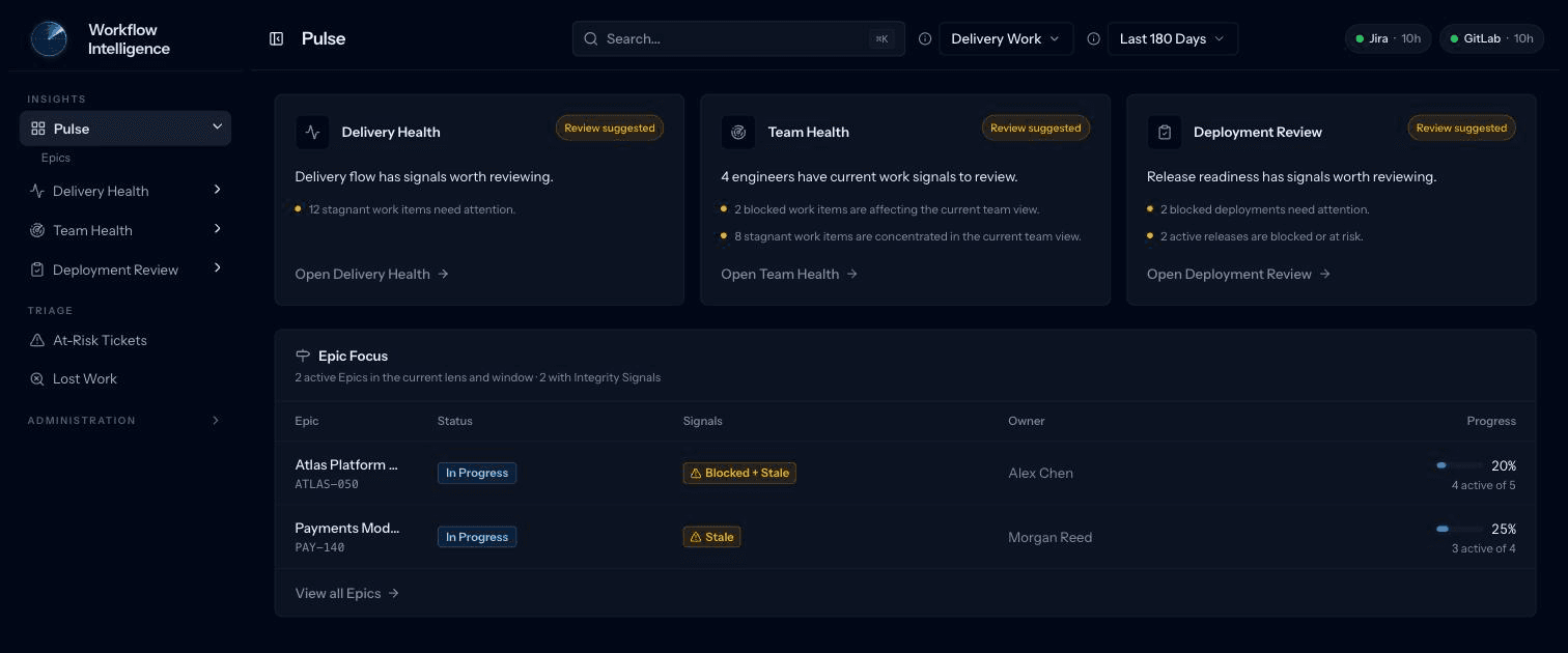
Pulse is an executive briefing layer, not another dashboard to check. Three briefing cards summarize delivery health, team health, and deployment review, each surfaced only when there is a signal worth reviewing, with a direct link into the supporting evidence instead of a wall of metrics to sift through.
Why is delivery slowing down?
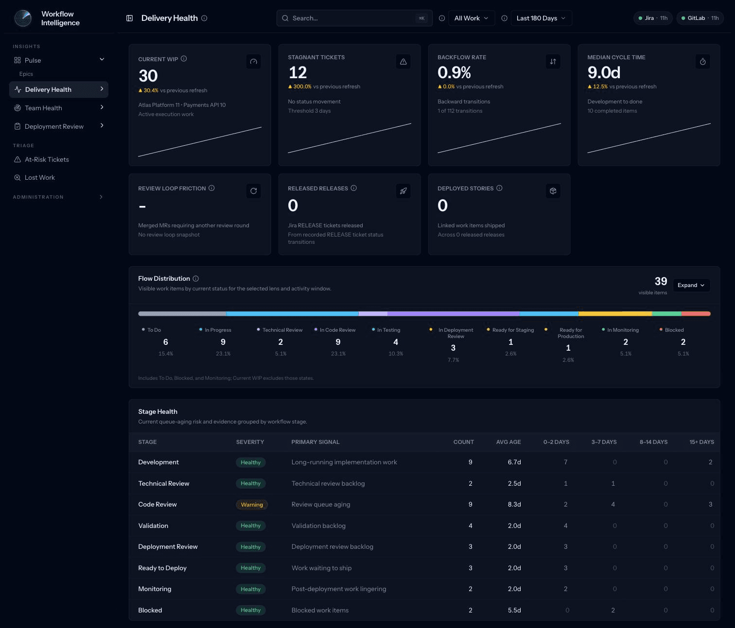
Delivery Health isn't a metrics wall either. Stage Health shows queue-aging risk by workflow stage, Flow Distribution shows where work currently sits, and queue aging buckets show how long it's been sitting there. Together they turn “delivery feels slow” into a specific stage, with a specific age distribution, worth investigating.
Show Me the Evidence
A queue-aging number on Delivery Health isn't the end of the story — it's the start of one. Clicking into a stage opens the exact work items behind it, and from there the investigation keeps going: work item, to merge request, to release.
Every aggregate metric can be traced directly back to the work items responsible for it.
- 1
Evidence Dialog
Clicking a stage total opens the exact work items behind it — the moment an aggregate becomes a specific, inspectable list.
- 2
Work Item
Opening a row surfaces the ticket's full context: workflow metadata, assignee, stage history, and its related evidence.
- 3
Merge Request
The same Related Evidence link follows the ticket into its code — implementation and review, not just a status label.
- 4
Release
And from there into the release it shipped in, alongside every other work item that went out with it.
Cross-linked Evidence
The Work Item and Merge Request drawers share one layout and one Related Evidence section, so moving between a ticket and its code is a click, not a context switch. Both link to the same Jira work item, merge request, and release — navigating relationships in the engineering graph instead of bouncing between disconnected pages.
Rather than opening disconnected pages, users move through the engineering graph without losing context.
Who needs help?
Team Health surfaces workload and review-bottleneck signals — idle tickets, large WIP, MRs waiting on review — as things worth a conversation, not a ranking. The goal is understanding where a developer is constrained, not scoring them against each other.
Is this release safe?
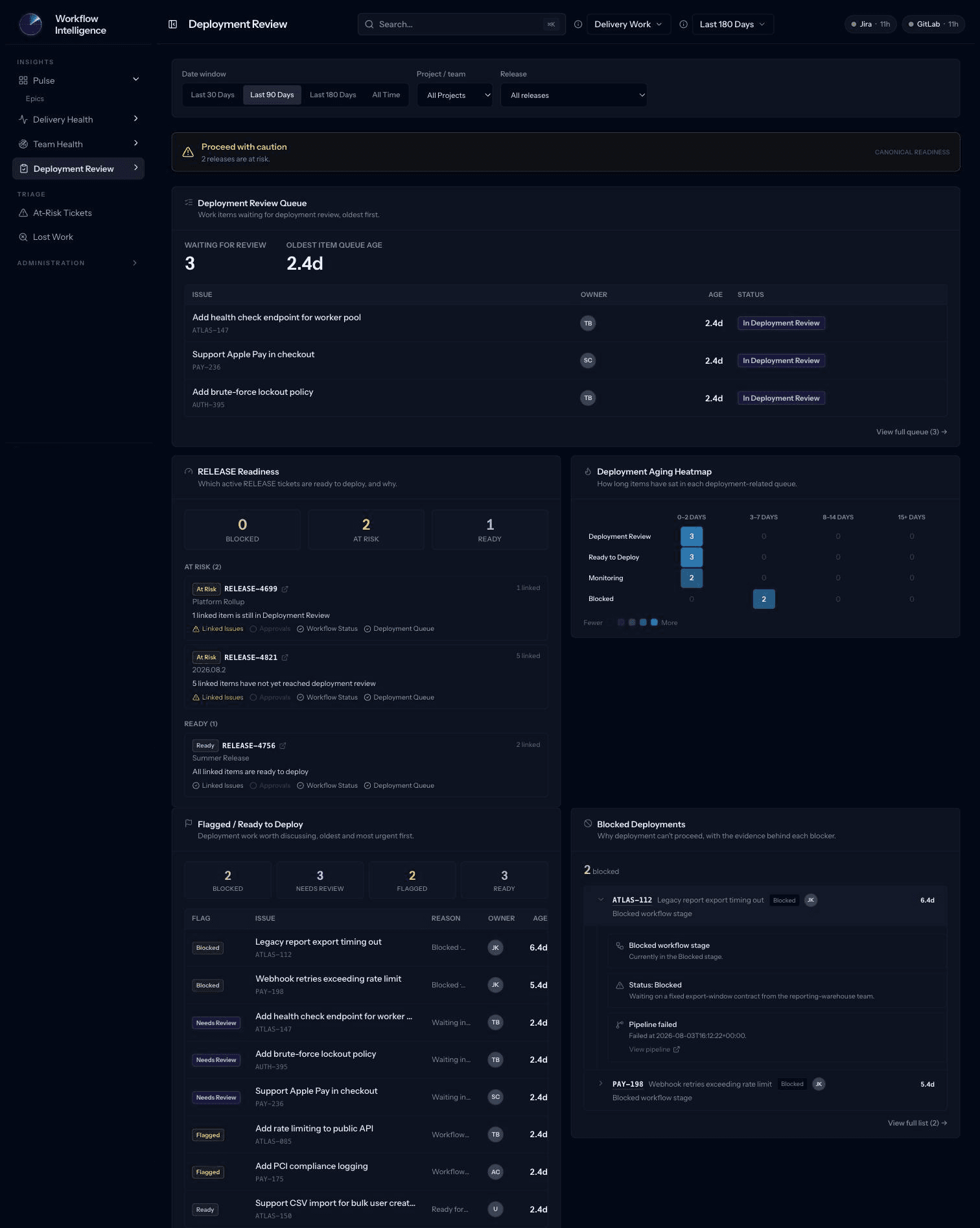
Deployment Review answers the question a release manager actually asks before shipping: what's blocked, what's at risk, and why. It combines release readiness, merge request quality, and deployment queue aging with an AI-generated operational summary — interpretation layered on top of deterministic evidence, not a replacement for it.
Building Trust Through Determinism
AI shows up throughout the platform, but never as the source of a number. The metrics are computed once, deterministically, and reused everywhere they appear.
AI explains the data. It never invents the data.
- Deterministic metrics: every number is computed the same way, every time. No AI-generated scores in the calculation path.
- The same evidence queries that back the drawers also power the dashboards, so an aggregate and its detail can never quietly drift apart.
- Canonical workflow and status definitions, shared across Jira and GitLab data instead of redefined per screen.
- One shared taxonomy and one source of truth: dashboards, drawers, and AI summaries all read from the same underlying computation.
Interesting Engineering Challenges
Unified Evidence Navigation
Designed a shared drawer architecture allowing users to move between Work Items, Merge Requests, and Releases without losing context.
Evidence-first Analytics
Every KPI links directly to the underlying work responsible for the metric, not just a number on a card.
Demo Mode
Built a fully isolated demonstration environment with deterministic synthetic engineering data for portfolio screenshots, while preserving production behavior.
Shared Metric Engine
Centralized workflow calculations power dashboards, AI summaries, and evidence dialogs from the same underlying computation pipeline.
Technical Highlights
- Backend
- Laravel • MySQL • Query optimization • Metrics engine • Evidence APIs
- Frontend
- Vue • TypeScript • Inertia • Headless UI / Reka UI • Tailwind
- Architecture
- Shared query services • Deterministic analytics • AI abstraction layer • Unified drawer system
Results
- Unified Jira and GitLab operational data into a single workflow model.
- Built multiple evidence-driven operational dashboards on top of it.
- Created reusable analytics services that power every dashboard from the same source.
- Developed cross-linked evidence navigation between engineering entities.
- Implemented a deterministic demo mode for portfolio and product demonstrations.
- Designed a scalable foundation for future workflow intelligence features.
What I'd Build Next
The current system answers today's operational questions well. The natural next step is answering tomorrow's:
Let’s Work Together
Interested in working together or have a question? Reach out and let’s talk!